VRR - Transport
Application
Year
2021
Duration
4 months
Role
Project Management
Interface Design
Tools Used


Case Study
Project Overview
The VRR (Verkehrsverbund Rhein-Ruhr) mobile application is the official public transport platform for the NRW region in Germany. Despite having over 1 million downloads, it lacked essential features, usability, and intuitive interactions, resulting in a suboptimal customer experience.
Objective
Redesign the VRR application to enhance its usability, accessibility, and customer experience through a Human-Centered Design (HCD) approach grounded in iterative prototyping and user testing.
Problem Statement
The existing VRR application failed to address essential commuter needs:
Cluttered, non-intuitive navigation
Missing essential features like real-time updates, push notifications, and intuitive ticket classification
Inefficient journey planning and map integrations
This directly impacted students and newcomers in the NRW region who depend on efficient public transport for their daily commutes.
Solution
A complete UX redesign based on qualitative and quantitative user research, competitor benchmarking, and iterative prototyping. The final deliverable was a high-fidelity prototype of a user-centric, accessible, and visually refined VRR app.

Design Goals & UX Strategy
Simplify navigation and reduce cognitive load
Integrate real-time updates and contextual notifications
Enhance ticket classification and journey planning
Follow a Human-Centered Design (HCD) process
Validate design decisions through continuous user testing and usability heuristics evaluation
UX Research
Context of Use
Targeted students and frequent commuters in the NRW region, focusing on their transport habits, pain points, and expectations from a regional transport app.
Competitor Analysis
Our competitive analysis provided a comprehensive understanding of industry standards and best practices, enabling us to pinpoint opportunities for innovation and improvement. We checked out all the competitors in the NRW region and analyzed the features they were ahead or lacking in and benchmarked them.
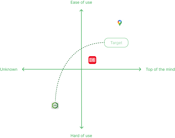
Summary
VRR: Good for local commuters but needs improvement in navigation and feature set.
Deutsche Bahn: Comprehensive and user-friendly for nationwide travel, though can be overwhelming.
Google Maps: Intuitive and versatile, best for multi-modal journeys but less specialized for regional transit details.
User Interviews & Surveys
We conducted an online survey using a carefully designed questionnaire to gather valuable insights and relevant feedback. This approach enabled us to understand the users' thought processes in depth, which is essential for creating accurate and effective user personas. The feedback received will guide our improvements and ensure our solutions align with user needs and expectations.
Participants
10 students (5 male, 5 female), aged 20–28, residing in NRW.

Key Insights
90% reported missing critical features
80% preferred alternative transport apps
60% found navigation unintuitive
40% complained about content accuracy and performance issues
Design Process
A dual-track agile design process combining Lean UX and Human-Centered Design methodologies.
Ideation & Sketching
Mapped key user flows and UI screens using hand-drawn sketches to visualize core functionalities before investing in detailed wireframes.
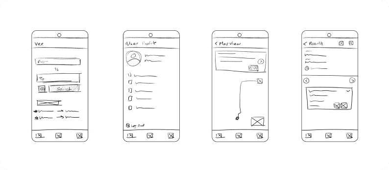
Low-fidelity Prototyping
Created a clickable prototype focusing on functionality and user flow validation
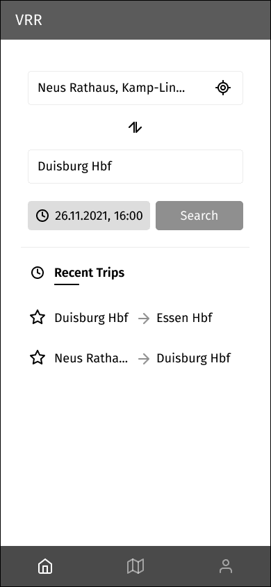
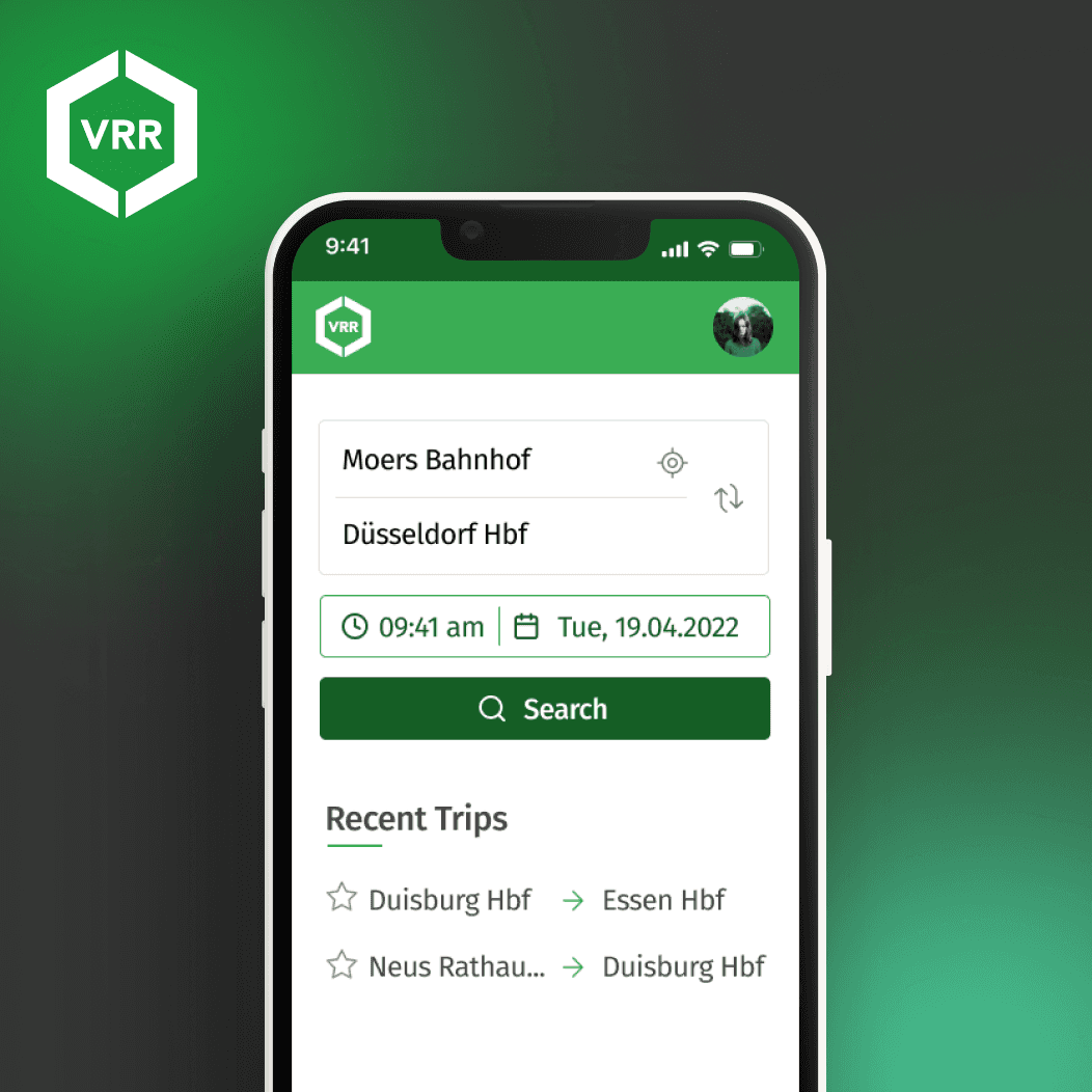
Home page
The homepage was redesigned to adopt a more familiar layout, enabling users to more easily identify and navigate the available options compared to the existing market applications.
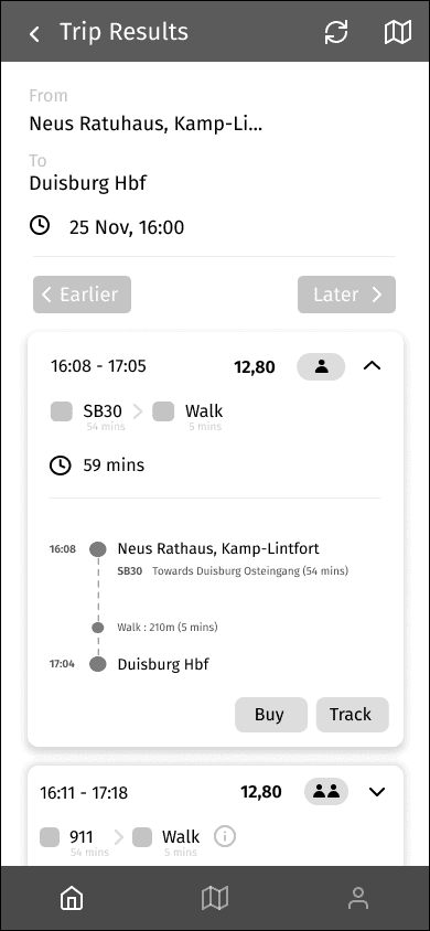
Trip Results
The trip results feature a clear delineation between different trips, allowing users to view their journey details, purchase tickets, and track their progress seamlessly.
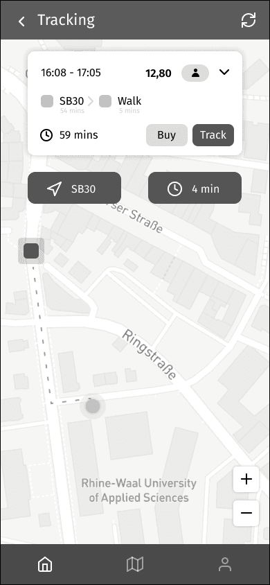
Tracking
We prioritized the application's primary function of assisting users with local transportation schedules. Consequently, incorporating a map-based tracking feature was deemed highly beneficial.
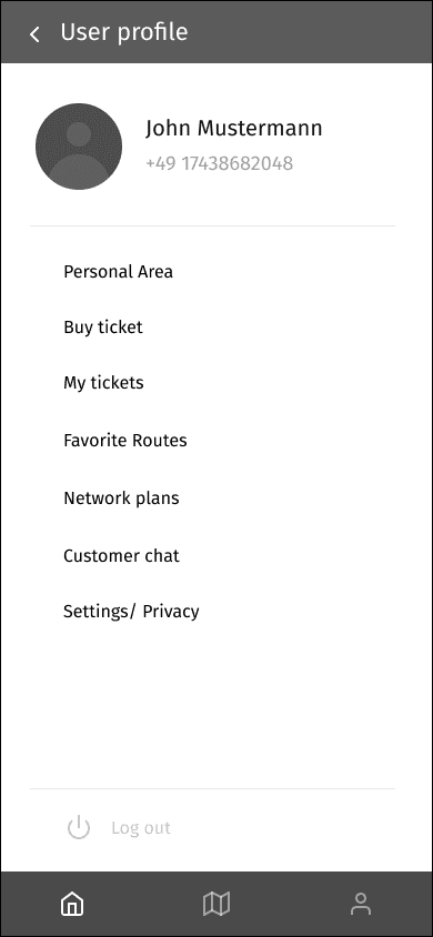
Customer Profile
The profile page was redesigned to create a more streamlined experience. Options were added and removed to enhance functionality and reduce confusion compared to the original application.
User Testing
In-person moderated usability testing with 3 participants
Tasks: Journey planning, ticket purchase, and app navigation
Tools: Task analysis, think-aloud protocol
Findings
Following the detailed analysis of user feedback, our team identified key areas for enhancement. The feedback collected provided invaluable insights that guided our design and development process for the VRR application. The primary feedback points included:
Crowded Icons: Users reported that the interface appeared cluttered, which complicated navigation and usability.
Auto-refresh Functionality: The need for an auto-refresh feature was highlighted to improve real-time information accuracy.
Map Screen Flow: Separate map screens were found to be confusing, necessitating a more integrated approach.
Cleaner Results: Users desired a more streamlined and clear presentation of search results.
Push Notifications: Implementing notifications for reaching destinations was suggested to enhance user convenience.
Send Button Clarity: The functionality of the send button was not immediately clear to users.
Ticket Classification: The categorization of tickets was found to be confusing, indicating a need for a more intuitive layout.
High-fidelity Prototyping
Refined prototypes in Figma using design systems and atomic design principles while retaining brand guidelines and color palette.

Home page
The homepage was redesigned to complement the original application, maintaining the same color scheme while optimizing the layout for improved usability and visual appeal.
Low-fidelity User Feedback
The home page was confusing with different tabs for the same process
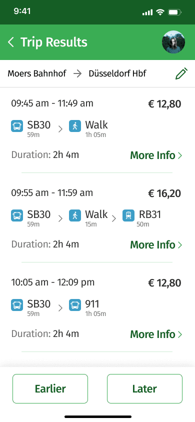
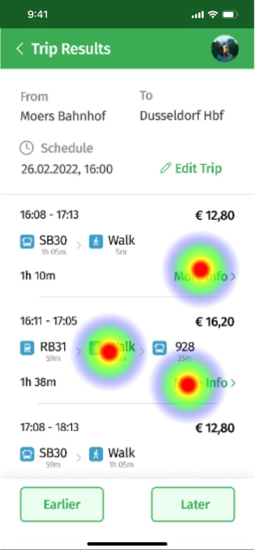
Trip results
The Trip results page was refined to enhance user experience, making it easier for users to access and understand their trip information quickly.
Low-fidelity User Feedback
The crowded icon was confusing, and the page looked congested.
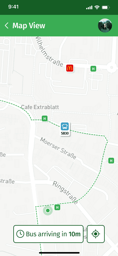
Tracking
In this iteration, the map view is primarily used for tracking purposes rather than existing as a separate page like in the low-fidelity design. It now provides detailed information and highlights surrounding areas to facilitate easier travel and is implemented directly into the trip info rather than being a standalone screen.
Low-fidelity User Feedback
Separate map view was confusing and the interface of the page was confusing.
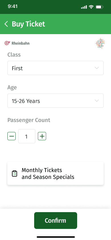
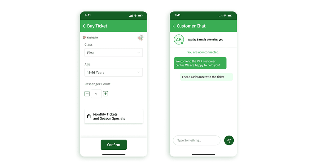
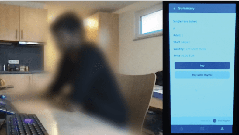
Buy tickets
This page underwent significant changes to improve usability. Options were simplified for better understanding, and complexities from the original and low-fidelity versions were removed. With the feedback with the complexity, nothing can be changed because it is connected to the naming system of transport services in Germany.
Low-fidelity User Feedback
Too many options to choose from and unable to understand the meaning.
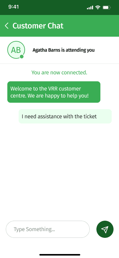
Customer chat
The customer chat page was initially added for basic functionality and user safety. Based on feedback from the low-fidelity prototype, we dedicated more effort to enhancing this page, making it a crucial part of the application.
Low-fidelity User Feedback
The name tag was confusing whether it was the user or customer center and the send button was misleading
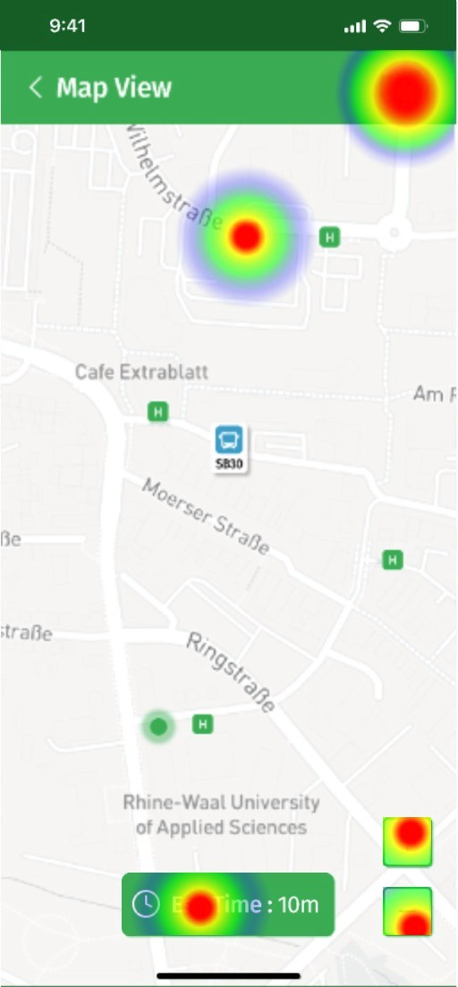
Validation
Heatmaps via Figma analytics plugin
Remote moderated usability testing with 7 users
Outcome
Significant improvement in navigation clarity, information hierarchy, and task completion rate.
Key UX Improvements
The issues were rectified and are made sure to improve the user's experience from the old version to the new improved version.


Improvements
Clean, intuitive, and minimal interface
Integrated, context-aware map experience
Simplified ticket classifications
Push alerts for arrivals and disruptions
Automatic, real-time updates
Business Impact & Strategy
Revenue Streams
Ticket sales via HandyTicket Deutschland
Brand partnerships for in-app promotions and CRM integration
Corporate deals for bulk VRR cards for employees
Market Expansion
Focus on newcomers, international students, and industrial workers within the NRW region.
Future Roadmap
Continuous feedback integration via UX metrics and usability benchmarking
Advanced features: voice control, multilingual support, personalization
Interactive onboarding and contextual tooltips
Real-time journey tracking and AI-driven route recommendations
Optimize for performance and network latency
Conclusion
Through a structured, iterative, and evidence-based UX design process, we transformed VRR from a frustrating utility into a user-centric, efficient, and scalable public transport solution.
Key Takeaway
Empathetic design backed by continuous user validation and lean, agile workflows leads to not just usable — but delightful experiences.